 I don't understand Tropicana's new packaging.
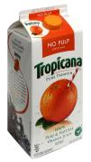
For years Tropicana was easily identified by its iconic symbol of a straw inserted into an orange. Nothing could say fresh orange juice faster or clearer. It's a unique and ownable mnemonic that nails the brand benefit.
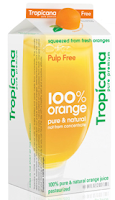
 But Tropicana dumped this for, get this, a picture of a glass of juice. What could be more generic? Along with the new typography, the packaging exudes the feel of a store brand or a generic knock-off of a national brand. The existing packaging needed to be refreshed, but I think they went way too far by dropping the orange and straw.
This speaks to the fragility of great ideas. It takes years to build and own an iconic idea, but it takes only one bad decision to squander it.
