I was driving this weekend near St Paul and noticed a highway sign with two gas station logos placed side-by-side. One was for BP, the other for Sinclair gas.
My first reaction was astonishment in realizing that Sinclair still exists -- in my head it's a brand that dates back to the Model T that perhaps had gone the way of its logo...which is a dinosaur. Apparently not.
Seeing both logos next to each other provided a great illustration of the power of brand identity systems. You cannot find two more opposite identities for the exact same product. BP is the color of sunshine and flowers, it's logo conjuring a green company. (After all, isn't the new BP "beyond petroleum"?) And Sinclair is a dinosaur, conjuring decaying fossils buried under dirt and rock transformed into the oil that drives our Hummers by millions of years of heat and pressure.
I've been a fan of the BP identity since its launch. They've executed a total brand makeover from the corner gas station on up. Though I would like to see more evidence of what it is doing to go "beyond petroleum." A flower logo can only fool us for so long.
I give kudos to Sinclair for its honesty and consistency. If you're happy being a petroleum brand, then a dinosaur logo is spot on target. (By the way, you won't believe this, but the dinosaur's name is "Dino." Go figure.)
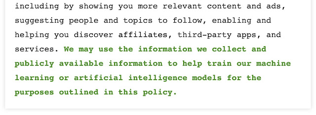
How the Handover Begins
Today’s New York Times features an article that pulls back the curtain on how the AI handover is getting underway, how Google, Meta, X, et a...
-
 I don't know who authored this quote, but I found it in this video of a presentation Yves Behar gave at TED about the need for design t...
 -
 I was thinking the other day about the DNA of premium brands . One thing is certain -- it's a relative idea. For example, Hyatt is...
 -
As a passionate Giants fan it is safe to say that I had a good time yesterday. But as an advertising professional I felt a bit underwhelmed ...